
Choosing floor tiles is one of those decisions that feels straightforward until you’re standing in front of three hundred options and none of the photographs look quite right on your phone screen. The floor goes down first and comes up last. Everything else in the room sits on top of it, literally and visually. Get it right and it makes the whole space. Get it wrong and it bothers you every single time you walk in.
Here’s what’s actually worth knowing before you commit to anything, including what the best floor tiles look like in 2026.
The Cool Greys Are Finally Over
For the better part of a decade, cool grey tiles dominated UK floors. Kitchens, bathrooms, hallways, they all got the same slate-grey treatment. It wasn’t a bad look. It just became an everywhere look and it’s now dated in a way that feels difficult to escape.
What’s replaced it is warmer, softer, and considerably more interesting. Honeyed taupes, warm putty, soft sand, caramel limestone, and gentle beige tones are running through nearly everything in the market right now. They read as calm and grounded rather than cold and clinical. They pair naturally with timber furniture, linen textiles, and brushed brass hardware. In practical terms, they also hide everyday marks and grime better than pale grey, which was always one of grey’s less-discussed shortcomings.
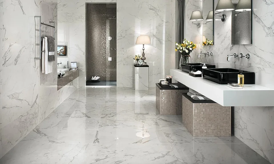
Stone-Effect Porcelain Is the Most Sensible Floor Tile in Most Homes
Real stone is beautiful. It’s also expensive, requires sealing, absorbs stains if you’re not on top of it, and some types don’t handle underfloor heating particularly well. Porcelain that replicates stone has caught up to the point where the visual difference in most domestic settings is genuinely difficult to detect.
Travertine-effect porcelain is one of the strongest performers right now. The warm, textured surface with its subtle natural variation creates a quietly luxurious feel without the maintenance overhead of actual travertine. It works in kitchens, bathrooms, hallways, and living rooms with equal ease. In bathrooms it replaces glossy marble with something more organic and calming. On kitchen floors it creates a relaxed Mediterranean quality. On patios and terraces it blurs the line between interior and exterior in a way that genuinely extends the feeling of a space.
The key is buying from a retailer that sources properly manufactured porcelain rather than the budget end of the market, where the printing quality falls apart on closer inspection.
Large Format Has Become the Default for Good Reason
Tile formats have grown steadily over the past few years and 2026 has accelerated that shift. Large-format tiles at 80 by 80 centimetres or 100 by 100 centimetres are now the standard choice in bathrooms, kitchens, and open-plan spaces. The reason is simple enough. Fewer grout lines create a more continuous surface. A more continuous surface makes rooms feel larger. It also means fewer joints where grime accumulates, which reduces maintenance over time.
The practical consideration is the subfloor. Large-format tiles need a level, properly prepared base to lay correctly. Any movement or unevenness in the substrate will show up much more obviously with a large tile than with a small one. Sort the subfloor before anything else and the installation follows straightforwardly.
Terrazzo Has Genuinely Grown Up
The terrazzo people remember from school corridors and mid-century public buildings was functional but rarely beautiful. What’s available now is a long way from that. Modern terrazzo-style porcelain has moved beyond the basic speckled pattern into layered chip variation across different scales, from fine micro-terrazzo that reads almost as a refined hotel finish to large aggregate pieces that turn a floor into a deliberate design feature.
The practical case for terrazzo floors is strong regardless of aesthetics. The speckled surface hides marks and stains more effectively than most uniform finishes. It works equally well on floors, splashbacks, and shower areas. It tends to look better in person than in photographs, which is the opposite of most things and makes it one of the safer online purchases in the category.
Checkerboard Is Back, But Not the Way You Remember It
The black-and-white checkerboard is having a revival but the version gaining ground in 2026 isn’t the high-contrast graphic version of the past. Designers are working with warm marble tones instead. Beige offset by warm umber, two stones with subtly different veining, honey and cream. The pattern stays but the temperature shifts from bold and graphic to elegant and grounded.
Porcelain versions make this more accessible and more practical for most homes. The pattern is strong enough to carry a room without additional decoration, which makes it well suited to simply furnished spaces where the floor itself does the design work.
Texture Is Doing More Work Than Pattern
Flat, uniform surfaces are starting to feel dated in a specific way. They look fine in photographs and slightly underwhelming in person. The tiles generating the most interest right now are surfaces where light does something. Subtle relief patterns, rippled finishes, handcrafted irregularity, honed stone textures that catch shadow differently throughout the day.
Textured tiles give character without the visual noise of a busy pattern. The interest comes from light and depth rather than print. Used in a bathroom floor, along a hallway, or across a kitchen, they create something that feels considered and personal rather than just covered.
Matt finishes are part of this. A smooth matt tile reads as refined and calm. It photographs well, ages well, and doesn’t show watermarks the way gloss does. For floors particularly, matt finishes are both more practical and more current than they were even two or three years ago.
What Actually Matters When You’re Choosing
Slip resistance is the practical specification most people overlook until they’ve got water on the floor and realised the tiles are more slippery than expected. For residential bathroom floors and shower trays, R9 is the minimum. R10 gives more grip and is appropriate for kitchens and areas where wet feet are likely. Confirm the slip rating before ordering anything for a floor that’ll regularly get wet.
Order samples. This is not optional. A tile that looks perfect on a screen can read completely differently under the lighting conditions in your actual room. Most decent retailers will send samples without much fuss. Put them in the room, look at them at different times of day, hold them next to your cabinets and worktops. Ten minutes of that work prevents a decision you’ll be looking at for fifteen years.
Order ten to fifteen percent more than your measured requirement. Cuts, wastage, and the occasional breakage during installation all eat into your estimate. More importantly, handcrafted and natural-effect tiles vary between production batches, and a top-up order placed months later may not match what’s already on the floor. Keep a small stock back after installation and you’ll thank yourself the first time a tile needs replacing.